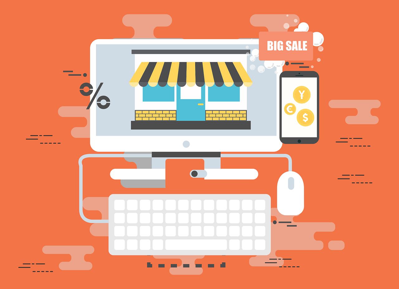
Unlocking Online Visual Merchandising: Little-Known Hacks, Underground Trends, and Exclusive Information for eCommerce Growth
In a digital world saturated with look-alike websites and cookie-cutter product pages, standing out requires more than just high-quality images and sleek design.
Online visual merchandising has become a powerful differentiator—when executed with precision, creativity, and a touch of insider strategy.
This blog post unveils little-known hacks, underground trends, and exclusive information that only the most in-the-know brands are leveraging to stay ahead of the curve.
From stealth tactics to future-forward innovations, these insights will help transform your store into a visually magnetic, revenue-driving machine.

Little-Known Hack: Use Scroll-Triggered Visual Reveal for Progressive Discovery
Standard eCommerce sites often overwhelm users by displaying too many visuals at once.
A smarter tactic is to implement scroll-triggered reveals—gradually loading visuals as users explore.
Why it works:
-
Enhances perceived performance and speed
-
Creates a sense of discovery and engagement
-
Gives designers more control over visual sequencing
For example, a product gallery might start with a bold lifestyle image, then slowly unveil product variants and detailed shots as the user scrolls.
This keeps users curious, increases time on site, and subtly nudges them through a visual funnel.
Underground Trend: Algorithmic Merchandising Layouts
While many stores still use fixed grid layouts, emerging platforms are offering algorithmic layout engines that optimize visual presentation in real time based on performance and user behavior.
These AI-driven tools automatically:
-
Reorder product thumbnails based on CTR or sales velocity
-
Highlight underperforming items with refreshed visuals
-
Test new arrangements on segments of users
Instead of relying on guesswork or manual changes, brands let machine learning decide the optimal visual layout—often resulting in higher click-through and conversion rates.
This underground trend is growing quietly, but those who embrace it early gain a massive edge in visual relevance and sales impact.
Exclusive Information: Hidden Data in Visual Heatmaps
Most brands use heatmaps to analyze where users click or scroll. But few realize the deep visual insights buried in this data.
Visual heatmaps can reveal:
-
Which image elements draw the most attention (faces, colors, patterns)
-
What part of a product photo is ignored entirely
-
How thumbnail composition influences browsing flow
Exclusive tip: Use heatmap overlays specifically on product carousels and category pages—not just on landing pages.
You’ll discover how image placement and visual hierarchy influence product discovery, not just button clicks.
This nuanced approach helps refine your merchandising with laser precision, increasing the chances of your key products getting noticed and purchased.
Little-Known Hack: Multi-Image Product Tiles
Most eCommerce sites use single static images for product tiles. A more engaging option? Multi-image tiles that alternate between views on hover or slide.
For instance:
-
Default view shows the front of a dress
-
Hover reveals the back or a close-up of the fabric
-
A third image might display the item being worn or styled
These micro-galleries deliver more product context upfront, reducing bounce rates from product pages and improving buyer confidence.
The key is using this tactic subtly—without overloading the thumbnail grid—so it adds functionality without compromising aesthetics.

Underground Trend: Visual Merchandising with Sound Integration
A new wave of eCommerce experiences is incorporating sound-based cues into visual merchandising—especially on hybrid platforms like immersive brand microsites.
Imagine:
-
A quiet pop when you hover over a new arrival
-
Soft ambient music playing as users browse a themed collection
-
Click sounds customized to match the brand’s aesthetic (e.g., wooden taps for an artisanal shop)
Sound isn’t for every store—but for experiential or premium brands, this layered sensory merchandising creates mood, brand recall, and emotional resonance that static visuals alone can’t match.
Expect this underground trend to evolve rapidly with the rise of audio-friendly platforms like AR and voice commerce.
Exclusive Information: Visual Merchandising Tags That Influence Perception
The language used on visual tags—like “Best Seller,” “Low Stock,” or “Editor’s Pick”—matters more than you might think.
But the design and placement of these tags are just as critical.
Here’s the exclusive formula that high-performing brands use:
-
Use contrasting colors to make badges pop without clashing
-
Position tags top-left for left-to-right readers (where the eye naturally lands)
-
Keep tag text concise and emotionally charged (“Trending Now,” “Just Dropped”)
Split-testing visual tag styles and messages can reveal massive differences in engagement and CTR—something most brands completely overlook.
Little-Known Hack: Strategic “Negative Visual Space”
Whitespace isn’t just about aesthetics—it’s a psychological tool. Expert merchandisers use negative space to:
-
Direct focus to hero products
-
Make premium items feel more luxurious
-
Prevent visual fatigue in scroll-heavy pages
A common mistake is crowding product tiles too closely, especially on mobile. Instead, use spacing to isolate high-priority items, subtly signaling importance.
This tactic has a “halo effect” on brand perception—users often associate well-spaced designs with high-end experiences, which in turn can boost perceived product value.
Underground Trend: Color Gradient Mapping Across Product Pages
Rather than using flat colors or neutral tones, some cutting-edge merchandisers are using color gradient mapping—where background colors or shadows subtly change based on product attributes.
For example:
-
Eco-friendly items might use green-to-brown fades
-
Premium tech gear may have steel-blue gradients
-
Wellness products could feature pastel transitions
This subliminal technique enhances mood, builds brand cohesion, and allows users to subconsciously associate colors with category cues.
It’s a niche trend, but one that’s gaining traction in forward-thinking UI circles—and perfect for brands seeking that next-level polish.
Exclusive Information: “Momentum Clusters” for Conversion Hot Zones
A recent discovery in conversion science is the power of momentum clusters—groupings of visually engaging products arranged in patterns that drive more exploration.
Rather than random product grids, these clusters:
-
Group 3-5 complementary items with increasing desirability
-
Use scaling or directional visuals to lead the eye
-
Create a mini visual funnel within the broader layout
By visually “clustering” high-performing or thematically linked items, you generate a browsing rhythm that guides users deeper into your catalog—boosting page views and conversions.
This merchandising structure is still off the radar for most, but the results speak for themselves.
Transform Your Store from Static to Strategic
As digital retail matures, online visual merchandising must become more than just good-looking design.
It should be a layered, strategic ecosystem—where every visual choice is backed by data, behavior, and emotional design.
By implementing these little-known hacks, riding underground trends, and applying exclusive information from behind the scenes, your store can evolve from ordinary to extraordinary.
Let your visuals do more than display—let them guide, persuade, and convert.